
Monday, February 7, 2011
BRINGING LOMBARDI HOME!
Monday, January 17, 2011
Senior Gallery


Friday, January 7, 2011
Home Isn't A Place...


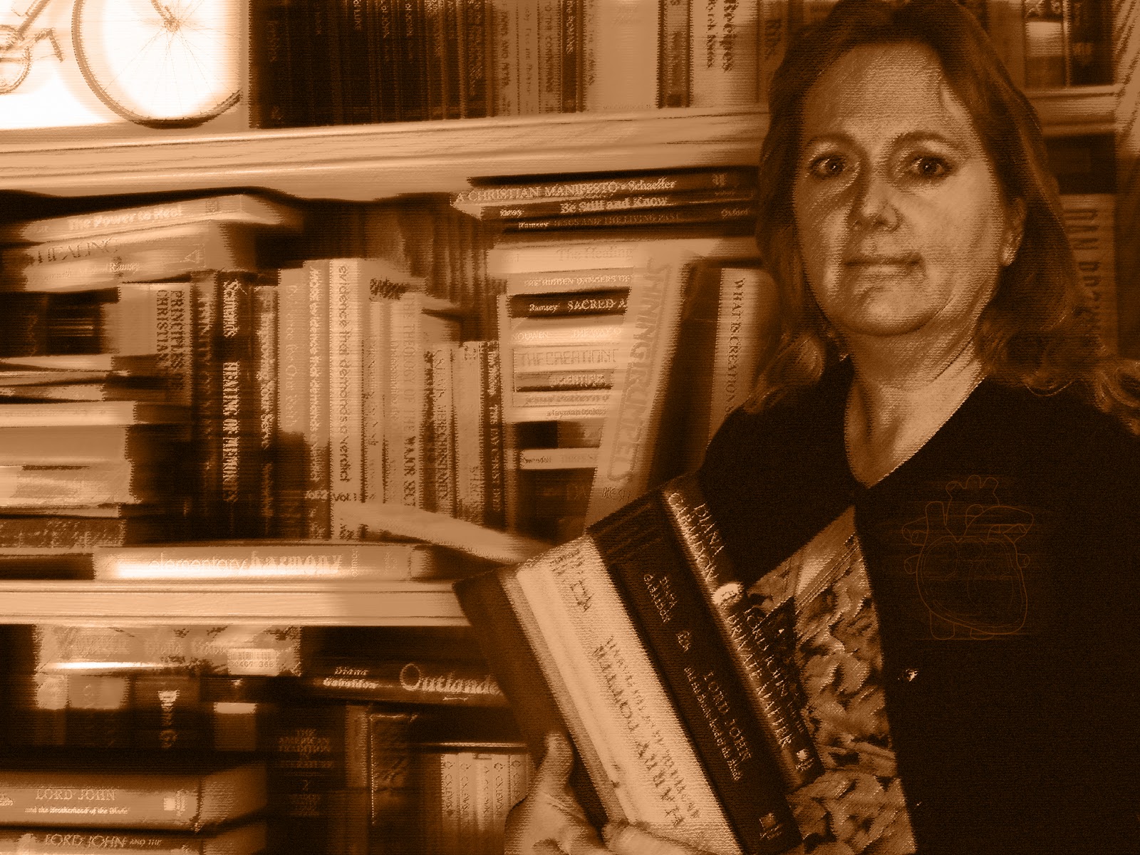
Home, for everyone should inspire feelings of warmth, comfort, and happiness. It is an unscathed memory of the past that remains in our minds for the rest of eternity. A house, technically may become a home, but a home is not defined by the material house itself. A "home" is defined by the people who live there and lay their hard-working hands on the objects within. Their influence, and presence is the heart and soul of a homely atmosphere. My mom, dad, sister, and dog all make my Victorian-era house into a Modern-era home. Each of the backgrounds they are portrayed in, illustrates their usual dwellings and activities. For me, imagining them in those place will send my thoughts hurdling homeward from wherever in the world I am. The colors I used are warm, inviting, and hint at the tones of human flesh. This, therefore, aids in the comprehension of my "Family make a house a home" message. Also, the heart image on each of my family members shows that home(family), is where the heart is.
Thursday, December 16, 2010
Half of a Green Face Mounted on Plexi-Glass?

For my free choice, I decided to dabble in the 3D world of artistic expression. I have always wanted to try my hand at sculpting, but the opportunity never really presented itself to me. This was my chance. I wanted to create a face with a expressionless or stoic expression, and for the color of the clay itself to model the feeling of the subject. I chose an eery green, and I believe it fits well with the black and clear composition of the rest of the piece. On another level, I decided that water running down over the face would add another aspect to the overall complexity. This was an a,most overwhelming challenge for me, as I set out to hand-make the frame, pump-housing, and water-tight base. Everything that could possibly have gone wrong, went wrong, and I almost abandoned the whole thing. But thankfully, a spare pump was found and utilized, and the whole thing started coming together. The piece uses asymmetrical composition, and movement to capture my emotion.
Tuesday, December 14, 2010
Social Justification
Overfishing is becoming a huge problem for the global population. With numbers of fish stock rapidly and exponentially decreasing, the worlds oceans are being netted into an oblivion. How would we feel if our populations become caught in the nets of some other species, causing our culture to teeter on the precipice of extinction. My piece illustrates this idea, and opens your eyes to the problem before us. I used movement, and similar colors to tie the images together, and create what I think to be a strong and meaningful piece of propaganda. To add a personal flare to this image, I added silhouettes of people I actually know in real life, and put them in the path of destruction before the net. I even created a logo for an imaginary foundation against the overfishing of the world's oceans.


Monday, November 1, 2010
"Bearly" a Portrait
 | ||||
| I know it's blurry, but even on the manual setting it was out of focus due to the curvature and texture. |


I used pastels, charcoal, and pencil to create my drawing. I used collage to for an interesting background, and added fur for added foreground texture. The three tears in my face, and the hanging nude of myself draw the eye down and to the right, causing movement.
I am a Bear. Ferocious, tenacious, powerful, and hungry. These traits are all within me and a part of me. In my self-portrait I am within the skin of a bear. I take on the essence of the bear, and mirror it's savagery in my face and body language. But, sometimes, this power cannot get contained and gets the best of me. It "tears" out of it's resting place within me, and sends me on a rapacious rampage. I end up clinging for dear life, on the edge of destruction or on the teeth of my destroyer. I in the end, will most likely be my own destroyer. I, the bear.
Wednesday, October 6, 2010
Free Choice

Subscribe to:
Posts (Atom)