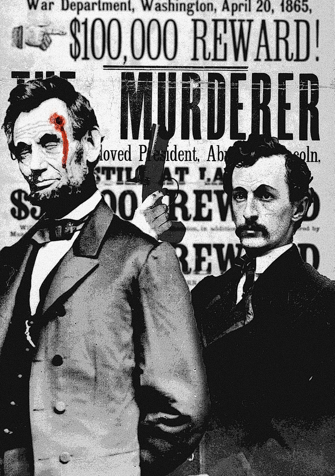
I believe my concentration to be clear, and focused. My works metaphorically, symbolically and allegorically define each icon's memorable life and highlights their tragic deaths. Some even go as far as to illustrate the methods by which their blood was spilled as in my piece "Abraham Lincoln" where John Wilkes deceitfully rests his pistol upon the shoulder Lincoln's corpse. By uncovering the poignant emotions that spring from their deaths, I am able to create a connection between the subject and the viewer. Understanding the life, and the death, of these prominent figures, the viewer becomes familiar with their essence and their beauty--which was cut short by treacherous plots or untimely accidents. I think this concept is easily traced through all my pictures.
My technical ability is evident in each of my pictures, and affects all aspects of my digitally rendered images. Over the past few years I have become very familiar with the workings of PhotoShop, and I am able to utilized this tool to the fullest. By collaging, and editing my images I am able to make them my own and avoid misrepresenting the work of other artists. For instance, in my piece "John F Kennedy" I compiled three different images into the final composition--each adding another layer to the next. This effect allows for a multi-tiered interpretation, and unique conception of the underlying idea.
Saturday, March 26, 2011
Monday, March 21, 2011
Ey Blinkin'...Get it?
Monday, February 7, 2011
BRINGING LOMBARDI HOME!

Monday, January 17, 2011
Senior Gallery


Friday, January 7, 2011
Home Isn't A Place...


Home, for everyone should inspire feelings of warmth, comfort, and happiness. It is an unscathed memory of the past that remains in our minds for the rest of eternity. A house, technically may become a home, but a home is not defined by the material house itself. A "home" is defined by the people who live there and lay their hard-working hands on the objects within. Their influence, and presence is the heart and soul of a homely atmosphere. My mom, dad, sister, and dog all make my Victorian-era house into a Modern-era home. Each of the backgrounds they are portrayed in, illustrates their usual dwellings and activities. For me, imagining them in those place will send my thoughts hurdling homeward from wherever in the world I am. The colors I used are warm, inviting, and hint at the tones of human flesh. This, therefore, aids in the comprehension of my "Family make a house a home" message. Also, the heart image on each of my family members shows that home(family), is where the heart is.
Thursday, December 16, 2010
Half of a Green Face Mounted on Plexi-Glass?

For my free choice, I decided to dabble in the 3D world of artistic expression. I have always wanted to try my hand at sculpting, but the opportunity never really presented itself to me. This was my chance. I wanted to create a face with a expressionless or stoic expression, and for the color of the clay itself to model the feeling of the subject. I chose an eery green, and I believe it fits well with the black and clear composition of the rest of the piece. On another level, I decided that water running down over the face would add another aspect to the overall complexity. This was an a,most overwhelming challenge for me, as I set out to hand-make the frame, pump-housing, and water-tight base. Everything that could possibly have gone wrong, went wrong, and I almost abandoned the whole thing. But thankfully, a spare pump was found and utilized, and the whole thing started coming together. The piece uses asymmetrical composition, and movement to capture my emotion.
Tuesday, December 14, 2010
Social Justification
Overfishing is becoming a huge problem for the global population. With numbers of fish stock rapidly and exponentially decreasing, the worlds oceans are being netted into an oblivion. How would we feel if our populations become caught in the nets of some other species, causing our culture to teeter on the precipice of extinction. My piece illustrates this idea, and opens your eyes to the problem before us. I used movement, and similar colors to tie the images together, and create what I think to be a strong and meaningful piece of propaganda. To add a personal flare to this image, I added silhouettes of people I actually know in real life, and put them in the path of destruction before the net. I even created a logo for an imaginary foundation against the overfishing of the world's oceans.


Subscribe to:
Posts (Atom)