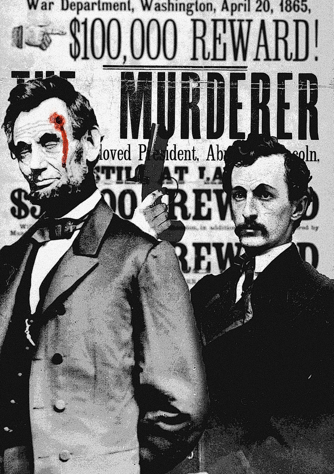
I believe my concentration to be clear, and focused. My works metaphorically, symbolically and allegorically define each icon's memorable life and highlights their tragic deaths. Some even go as far as to illustrate the methods by which their blood was spilled as in my piece "Abraham Lincoln" where John Wilkes deceitfully rests his pistol upon the shoulder Lincoln's corpse. By uncovering the poignant emotions that spring from their deaths, I am able to create a connection between the subject and the viewer. Understanding the life, and the death, of these prominent figures, the viewer becomes familiar with their essence and their beauty--which was cut short by treacherous plots or untimely accidents. I think this concept is easily traced through all my pictures.
My technical ability is evident in each of my pictures, and affects all aspects of my digitally rendered images. Over the past few years I have become very familiar with the workings of PhotoShop, and I am able to utilized this tool to the fullest. By collaging, and editing my images I am able to make them my own and avoid misrepresenting the work of other artists. For instance, in my piece "John F Kennedy" I compiled three different images into the final composition--each adding another layer to the next. This effect allows for a multi-tiered interpretation, and unique conception of the underlying idea.
Saturday, March 26, 2011

Monday, March 21, 2011
Ey Blinkin'...Get it?
Monday, February 7, 2011
BRINGING LOMBARDI HOME!

Monday, January 17, 2011
Senior Gallery


Friday, January 7, 2011
Home Isn't A Place...


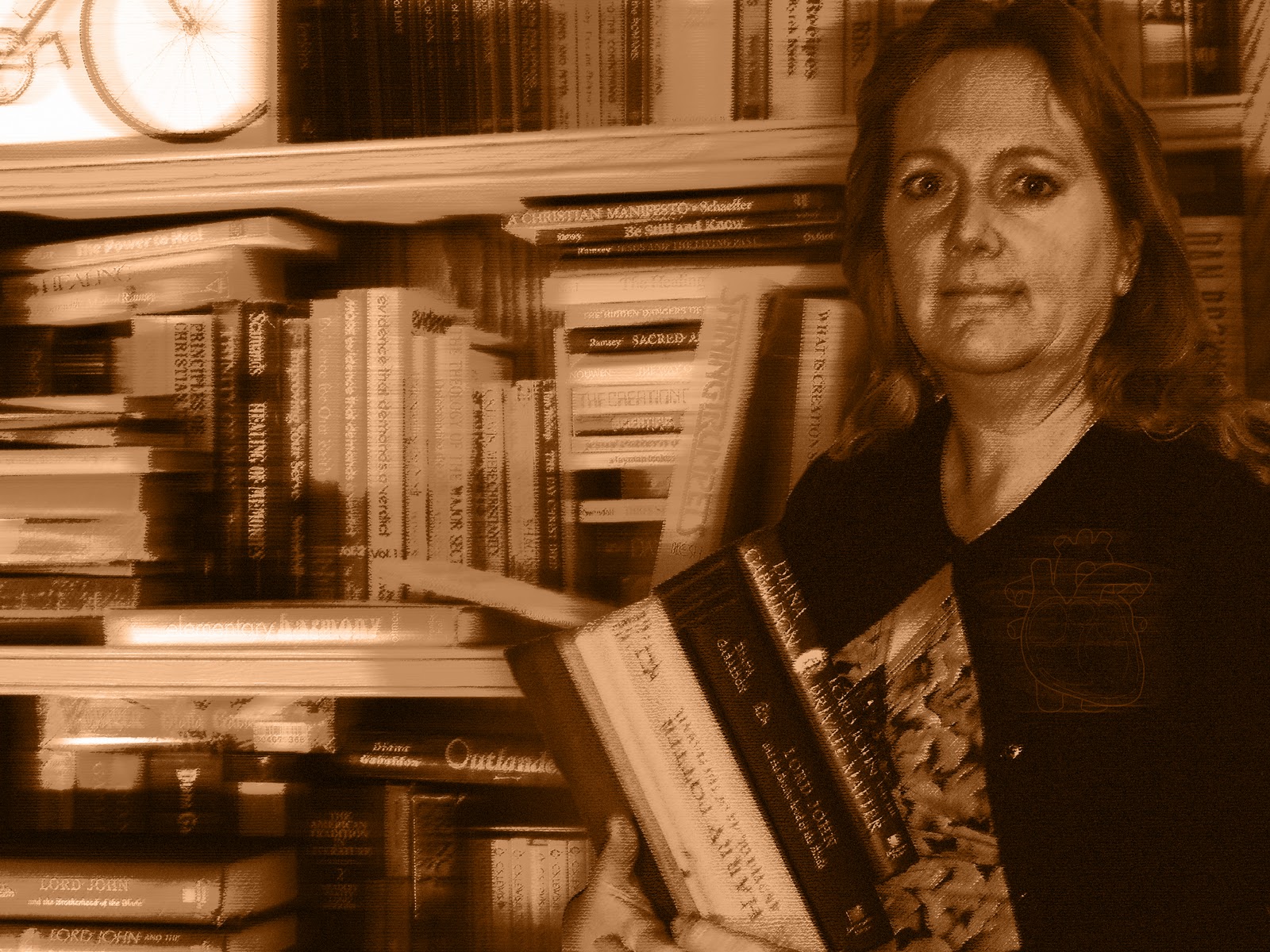
Home, for everyone should inspire feelings of warmth, comfort, and happiness. It is an unscathed memory of the past that remains in our minds for the rest of eternity. A house, technically may become a home, but a home is not defined by the material house itself. A "home" is defined by the people who live there and lay their hard-working hands on the objects within. Their influence, and presence is the heart and soul of a homely atmosphere. My mom, dad, sister, and dog all make my Victorian-era house into a Modern-era home. Each of the backgrounds they are portrayed in, illustrates their usual dwellings and activities. For me, imagining them in those place will send my thoughts hurdling homeward from wherever in the world I am. The colors I used are warm, inviting, and hint at the tones of human flesh. This, therefore, aids in the comprehension of my "Family make a house a home" message. Also, the heart image on each of my family members shows that home(family), is where the heart is.
Thursday, December 16, 2010
Half of a Green Face Mounted on Plexi-Glass?

For my free choice, I decided to dabble in the 3D world of artistic expression. I have always wanted to try my hand at sculpting, but the opportunity never really presented itself to me. This was my chance. I wanted to create a face with a expressionless or stoic expression, and for the color of the clay itself to model the feeling of the subject. I chose an eery green, and I believe it fits well with the black and clear composition of the rest of the piece. On another level, I decided that water running down over the face would add another aspect to the overall complexity. This was an a,most overwhelming challenge for me, as I set out to hand-make the frame, pump-housing, and water-tight base. Everything that could possibly have gone wrong, went wrong, and I almost abandoned the whole thing. But thankfully, a spare pump was found and utilized, and the whole thing started coming together. The piece uses asymmetrical composition, and movement to capture my emotion.
Tuesday, December 14, 2010
Social Justification
Overfishing is becoming a huge problem for the global population. With numbers of fish stock rapidly and exponentially decreasing, the worlds oceans are being netted into an oblivion. How would we feel if our populations become caught in the nets of some other species, causing our culture to teeter on the precipice of extinction. My piece illustrates this idea, and opens your eyes to the problem before us. I used movement, and similar colors to tie the images together, and create what I think to be a strong and meaningful piece of propaganda. To add a personal flare to this image, I added silhouettes of people I actually know in real life, and put them in the path of destruction before the net. I even created a logo for an imaginary foundation against the overfishing of the world's oceans.


Monday, November 1, 2010
"Bearly" a Portrait
 | ||||
| I know it's blurry, but even on the manual setting it was out of focus due to the curvature and texture. |


I used pastels, charcoal, and pencil to create my drawing. I used collage to for an interesting background, and added fur for added foreground texture. The three tears in my face, and the hanging nude of myself draw the eye down and to the right, causing movement.
I am a Bear. Ferocious, tenacious, powerful, and hungry. These traits are all within me and a part of me. In my self-portrait I am within the skin of a bear. I take on the essence of the bear, and mirror it's savagery in my face and body language. But, sometimes, this power cannot get contained and gets the best of me. It "tears" out of it's resting place within me, and sends me on a rapacious rampage. I end up clinging for dear life, on the edge of destruction or on the teeth of my destroyer. I in the end, will most likely be my own destroyer. I, the bear.
Wednesday, October 6, 2010
Free Choice

Tuesday, September 21, 2010
10 Pieces in 1 Week!
LOST


Under tight deadlines and a strict schedule, our AP Art class was instructed to create 10 original pieces--in a week's time. This project was the most time consuming school related thing I've ever done. Every night i worked tirelessly on completing as least one piece, and adding it to my amounting collection. I did this every night for a week, and in the end all came out well.
The concepts that my work was based upon were in many ways original and inspired great creativity, this was new to me. I was free to do whatever I wanted as long as it in some way related back to the word I was provided with. To create my art, I utilized a variety of materials. I used: charcoal, colored pencils, watercolor pencils, pen, permanent marker, collage, etc. After I completed the project and handed it over to be graded, I looked back at what I had done and what I had learned. I learned how to manage my time, how to create good work in a short time, and how to take something simple and spin it into a complex, thought provoking images.
My portfolio has also been impacted by this project. I have, in essence, decided on either drawing/mark-making or 2D Design. I feel comfortable with my decision, and with the work I have created. But, if i were able to improve one thing, I'd improve the overall complexity of my 10 pieces. Although some were overwhelming complex and beautiful, some lacked character and maintained a drab appearance. With the addition of a bit of complexity my collection would have came to life, reached out, and tugged on your heartstrings.
Monday, September 6, 2010
The Lay of the Land

AP ART 2010
Trite...

A World I Know Nothing Of...

Multitasking
Last year, I took two drawing classes, design, and photography. As a result, each element has bleached into the others--tainting and skewing them. Mostly elements of design and drawing have altered others and created a melting pot in my mind.
Drawings like the one below peak an interest in my altered state of mind, and I critique them in my head. Angles, color, drama, detail. They all are taken into account, and are represented in a well thought out space. I really like this drawing from an interior design magazine because I connect with it, and could see myself living in a space like it someday.

Hatred!
Beyond all else, I hate drawing textures. Crosshatching and other techniques for creating the feeling of an objects surface are tedious and i despise the very thought of them. However, with practice and guidance, someday I may be able to wield these techniques as a tool within my artistic arsenal.
 |
| I found this sample of texturing on an artistic practice site |
Better Than Me

Chris Brown - Crawl
Sticking to the inspirational music aspects of the artistic lifestyle, I have discovered a new song that I love, and the accompanying music video I love even more. The dance moves, and the artistic licenses used by the producer were original, and captivating. Although I don't know how I can mimic the effects used, I feel inspired to do so sometime soon

Sticking to the inspirational music aspects of the artistic lifestyle, I have discovered a new song that I love, and the accompanying music video I love even more. The dance moves, and the artistic licenses used by the producer were original, and captivating. Although I don't know how I can mimic the effects used, I feel inspired to do so sometime soon
The White Panda
www.whitepanda.com
In the past I have mostly wandered down the mainstream fork of the musical experience, but more recently I've ventured down the curvaceous and adventurous fork. On this exploration, I discovered a new genre of music. It mixes old school classics, with new school beats. With these tunes in my ear, I am inspired to try other things, and think with a different mindset. It's hard to explain, but direct your ears toward this new style and maybe you'll understand. Warning, though, some of the lyrics on this site may be explicit. Enjoy!
In the past I have mostly wandered down the mainstream fork of the musical experience, but more recently I've ventured down the curvaceous and adventurous fork. On this exploration, I discovered a new genre of music. It mixes old school classics, with new school beats. With these tunes in my ear, I am inspired to try other things, and think with a different mindset. It's hard to explain, but direct your ears toward this new style and maybe you'll understand. Warning, though, some of the lyrics on this site may be explicit. Enjoy!
Thursday, September 2, 2010
Fishin' In the Valley

Although no art was created on the trip, I feel that the journey has impacted my artistic view and style. The blacks and reds have faded from my mind, and cool natural colors have rush in--filling a long empty void. I don't know how to explain it, but it's a feeling I'm not willing to part with anytime soon.
Post-Plein Air
While at the competition, I had begun a second piece for submission but ran out of time and therefore, completion was impossible. I took my unfinished work home, and finished it. the subject matter of the piece was a yellow daisy overlooking the downtown street, and the grassy lawn. I used watercolor pencil to create it, and i believe it turned out well. It uses asymmetrical symmetry and utilizes the rule of thirds as well. Here's my finished piece, I hope you like it!


Subscribe to:
Posts (Atom)